Free Sankey Diagram Generator in 15 seconds
Create proportional flow diagrams instantly with our free AI generator. Energy, budgets, income statements, funnels — no Excel hacks, no code, no signup.
Sankey diagram configurations we generate
Sankey diagram examples across subjects
Sankey diagram templates in three styles
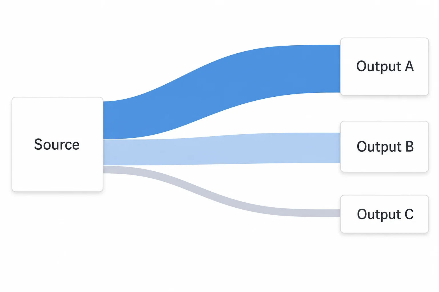
Free blank Sankey diagram templates in three styles. Download as PNG and fill in your own labels — or generate a labeled version with the tool at the top of the page in 15 seconds.
Meet the Diagram Agent
Type a Sankey flow in plain English. The agent searches the web for current data when needed (latest earnings, public energy stats), plans the layout, and renders it. Refine without restarting — say "merge the smaller revenue lines into Other" or "make the loss arrow thicker" and the agent revises in place.
Open the Diagram Agent →A featured prompt
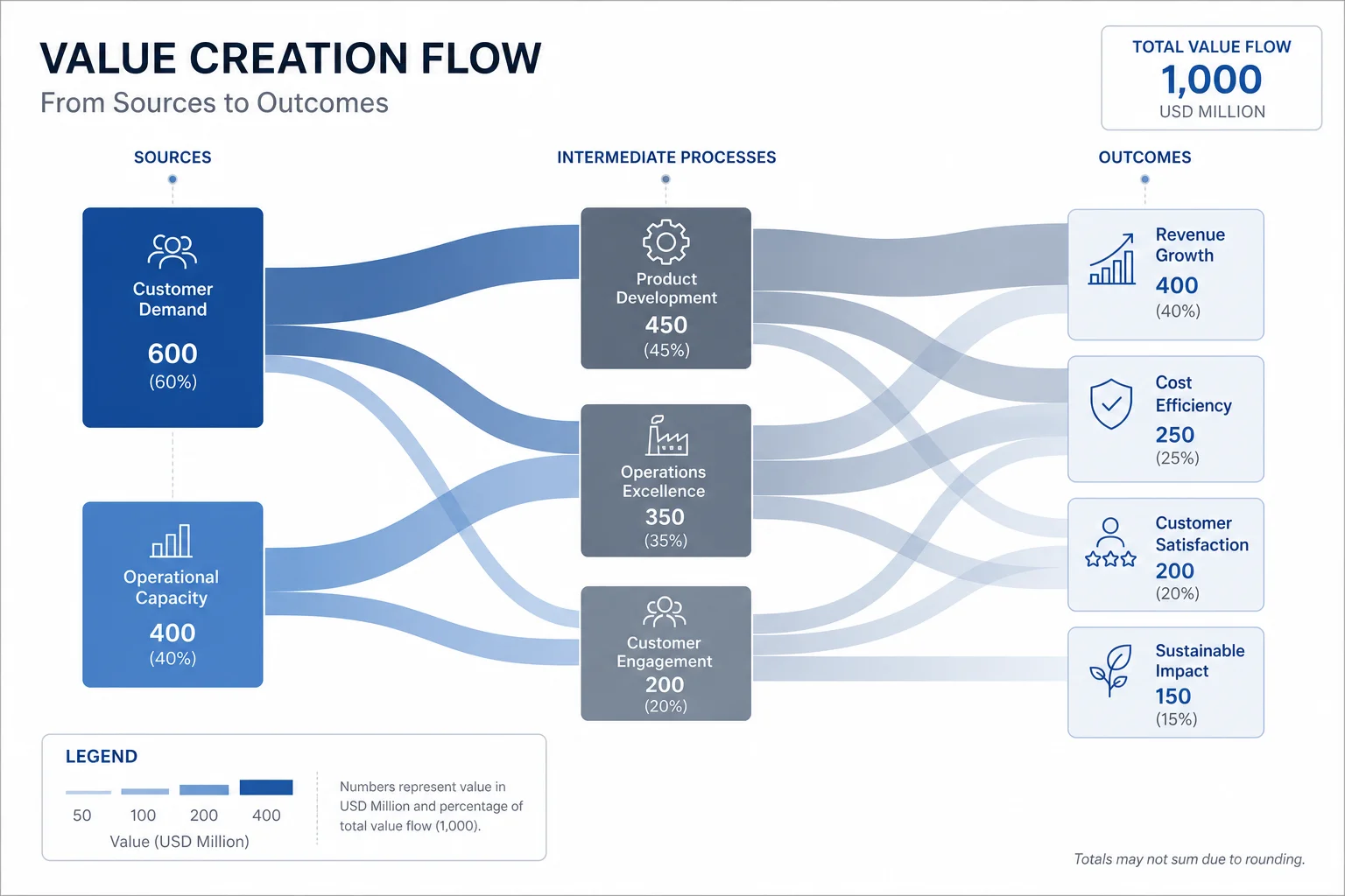
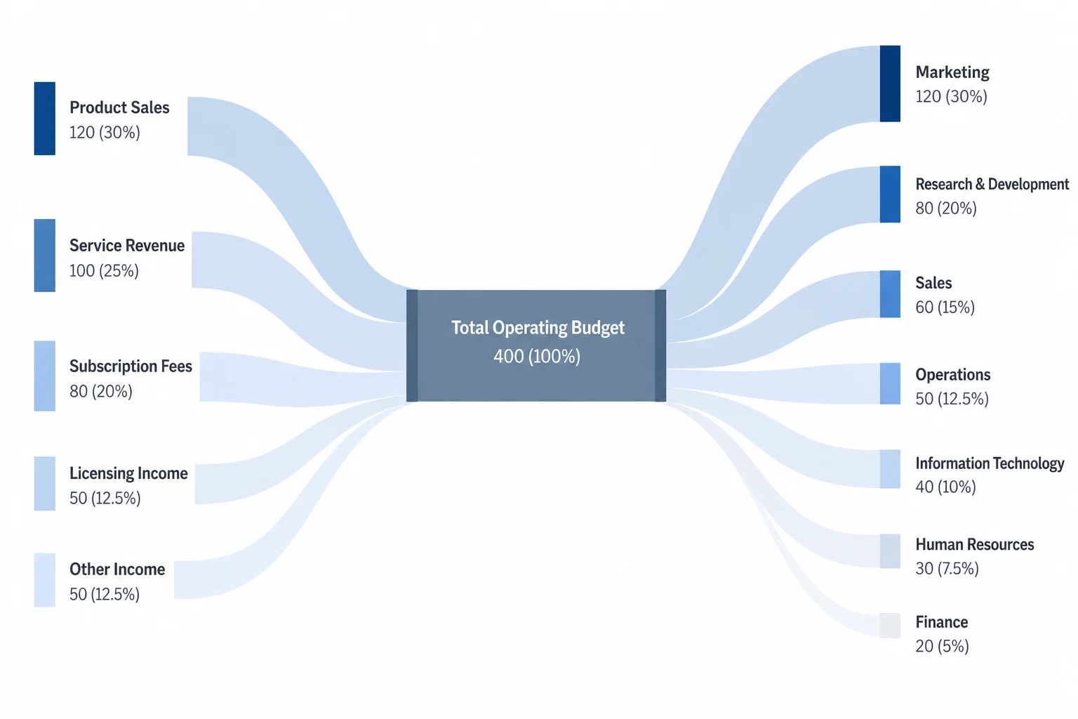
Tesla Q4 2024 income statement: $25.7B revenue split by automotive, energy, and services → COGS, opex, R&D → $2.3B net income. Corporate Clean style.
Frequently asked questions
Yes. Generate 5 Sankey diagrams free per day with no signup or credit card required. Free generations render at standard quality. Paid plans start at $9/month for more generations, higher quality renders, and full commercial rights.
Ready to generate your own?
Free tier: 5 generations per day, no signup required. No credit card. Full ownership and commercial rights on all paid plans.
Create a Sankey diagram ↑